Wayfinding on large-format touchscreens
Helping millions of shoppers orient themselves, find a destination, and remember the route with a few taps.
- When
- 2019–2022
- Where
- Mappedin
- What I did
- UI/UX design, Product strategy, User testing, Prototyping, Stakeholder co-design
Outcomes
- Achieved 80% adoption within six months.
- Deployed to thousands of venues and used by millions of shoppers each month.
- Created a new revenue stream with Directory Ads.
Context
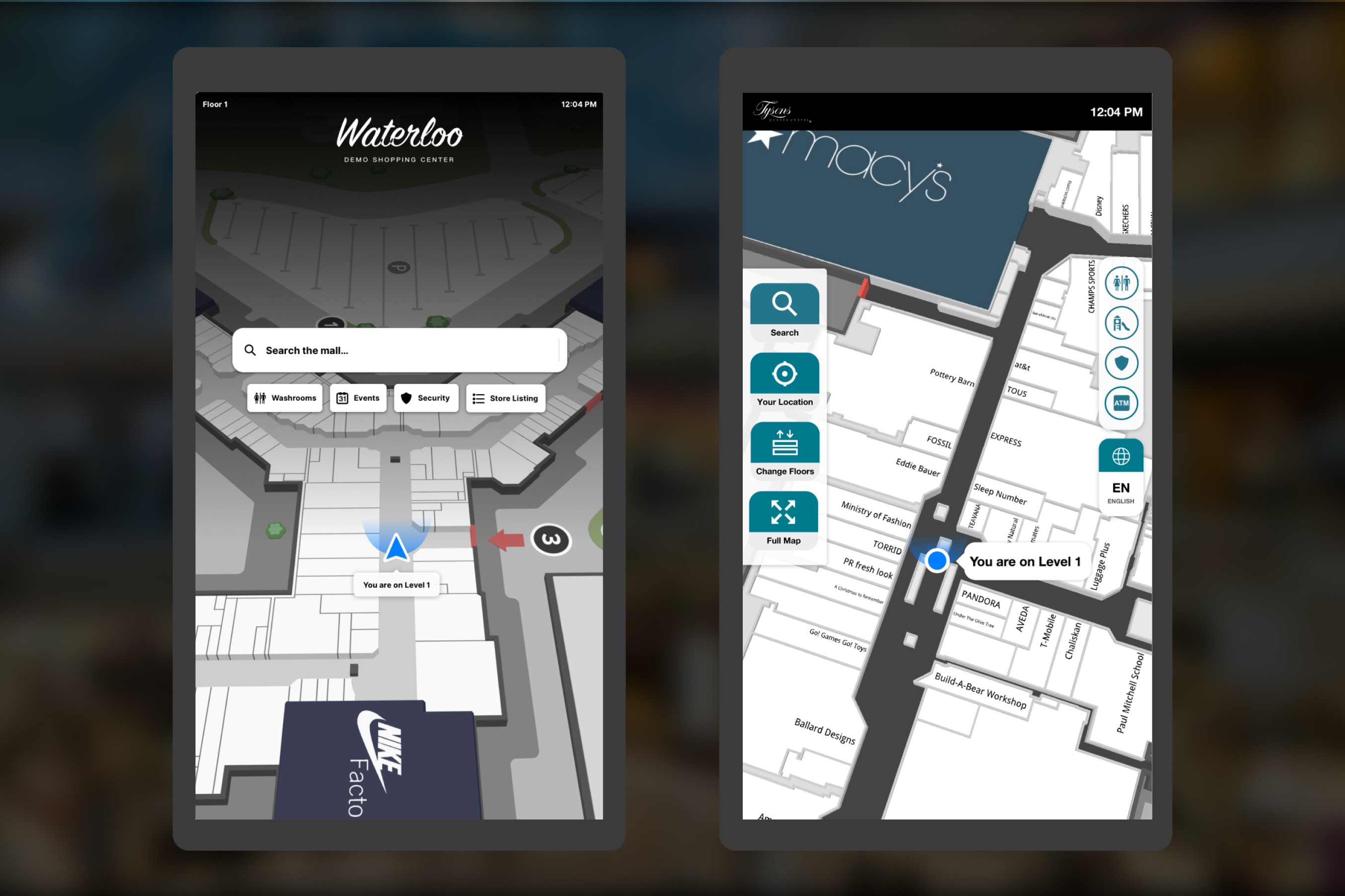
Mappedin's Digital Directory is a touchscreen wayfinding tool used in thousands of malls around the world, including destinations such as the Toronto Eaton Centre. We needed a new product version that made navigation and venue information more intuitive across hardware with very different screen sizes, mounting heights, and resolutions.
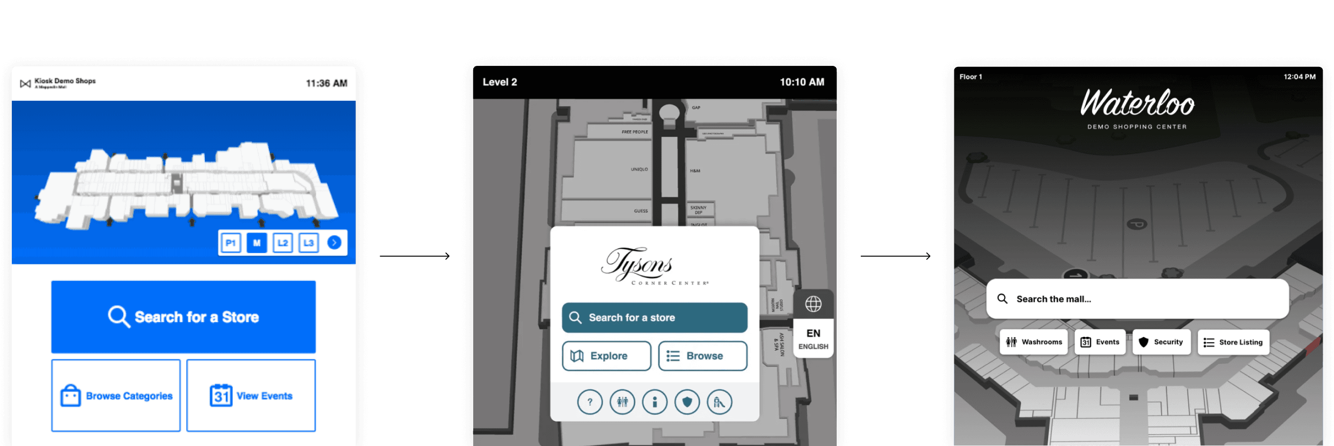
As our mapping platform became more sophisticated, the directory needed to evolve beyond its original role as a searchable store list.
Problem areas
- Search dominated the interface while the map was secondary, so directions were not always clear or intuitive.
- Limited map interaction made it difficult to orient yourself or explore what was nearby.
- Multi-floor navigation required people to switch floors manually while following a route.
- Venue owners had few ways to engage visitors beyond search and directions.
The interface had to be obvious to first-time and infrequent users—including people touching a large-format screen for the first time. It also needed to meet accessibility requirements, align with our mapping SDK and 3D data model, and create customer value through branding, analytics, events, and advertising.
Design process
Discovery and definition
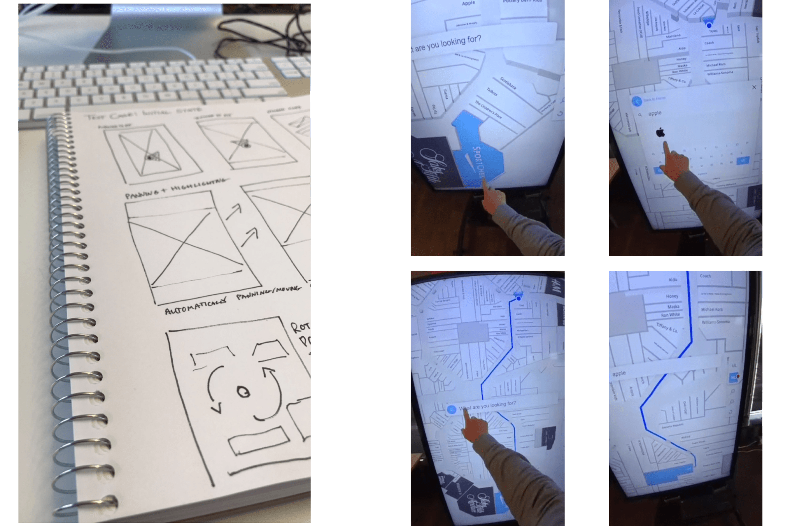
We worked with venue operators and end users to understand their needs, including co-design sessions with a marquee customer that helped define the core functionality.
Exploration and ideation
We reviewed accessibility standards, evaluated feedback on the existing directory, and explored multiple UI approaches. The central question was how much of the product could move onto the map without making focused tasks harder.
Design and prototyping
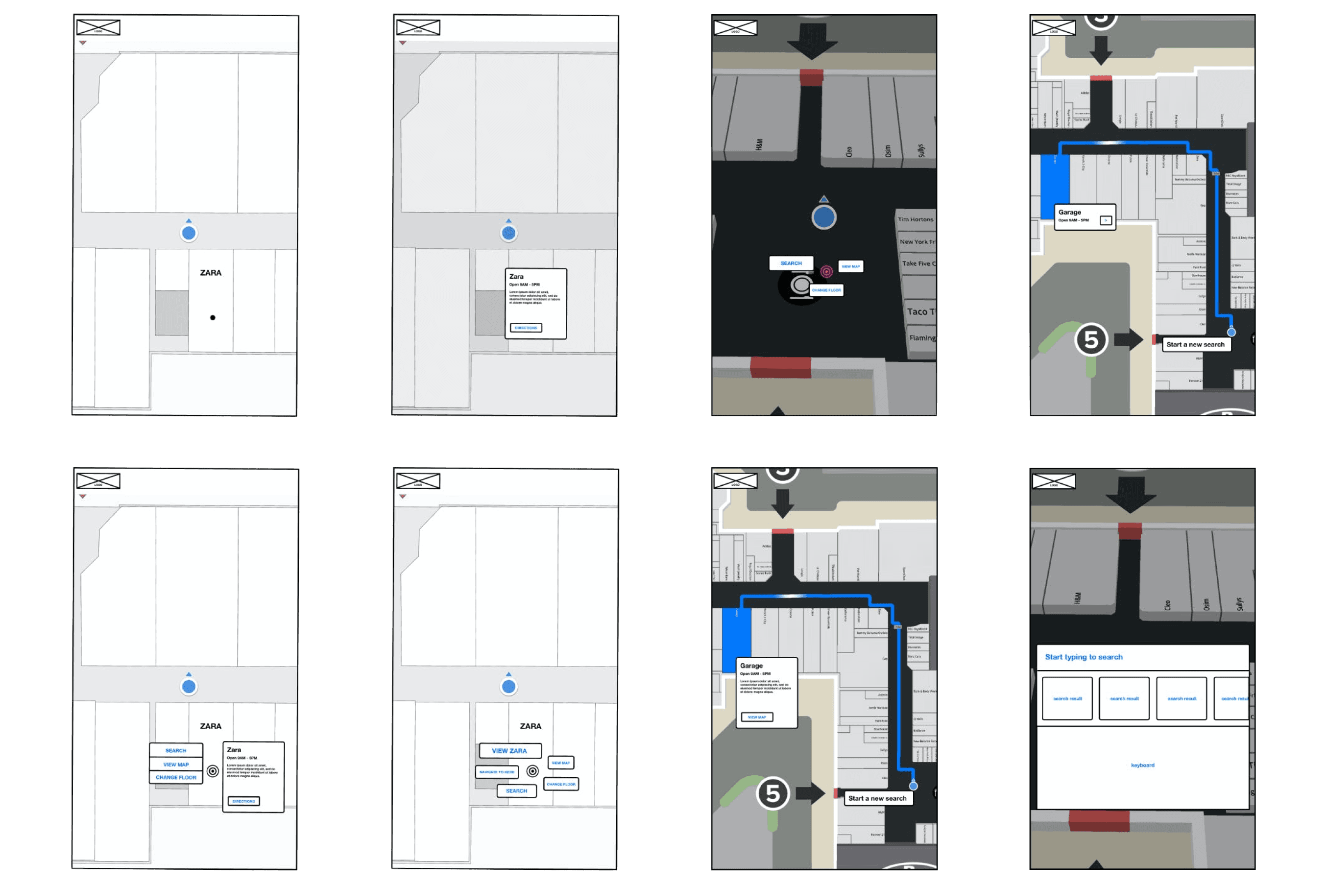
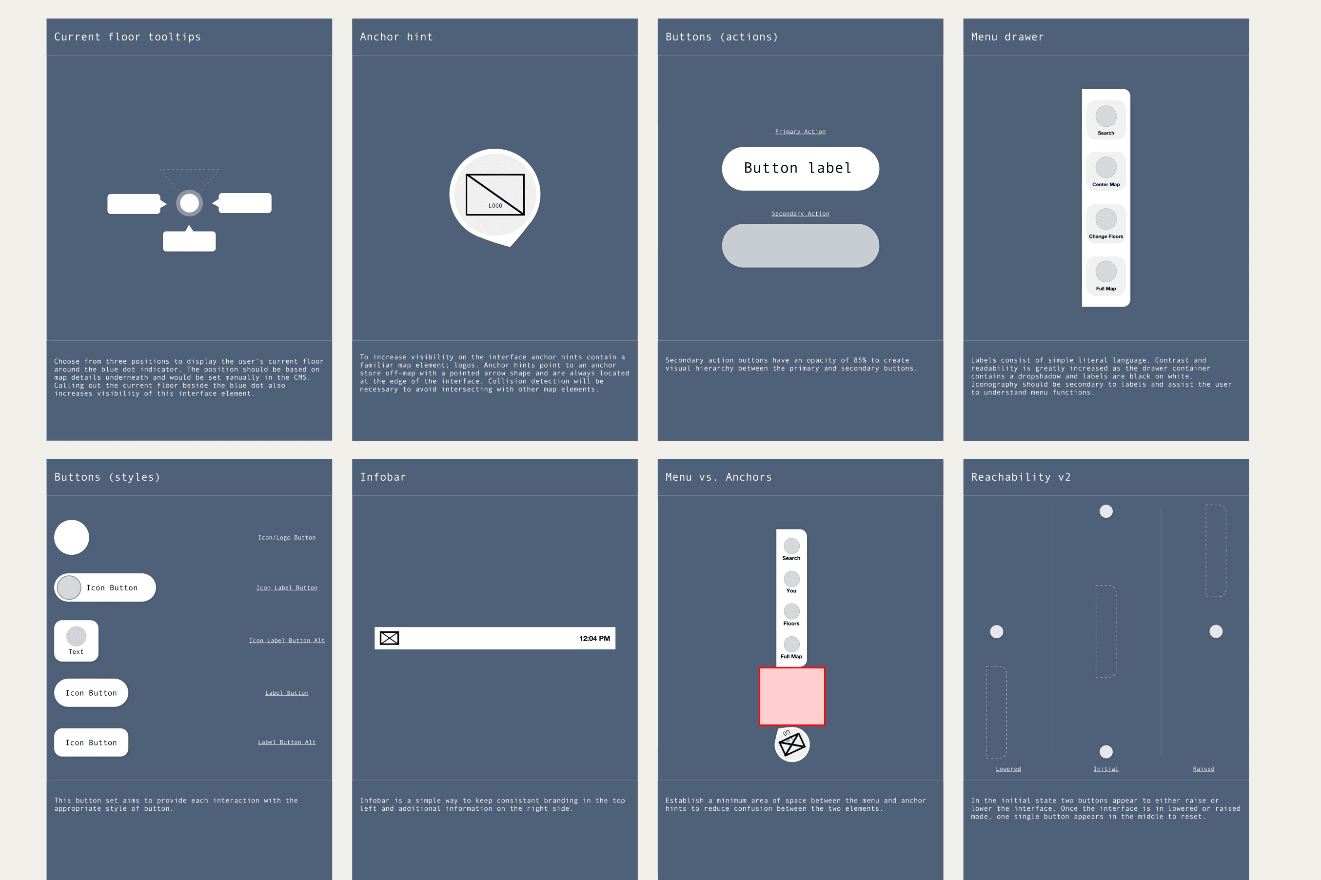
We built the important search, direction, and location-selection flows, then tested prototypes in the office on real hardware. Large-screen ergonomics changed basic assumptions about type size, reach, touch targets, and how much context could safely be shown.
Refinement and release
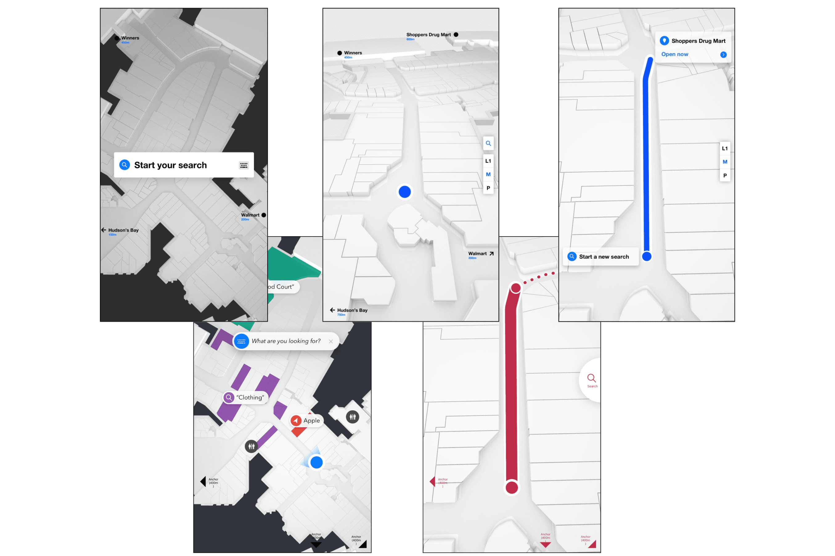
Design and engineering refined the product together, using in-venue testing and real-world feedback after deployment to guide each update.
Challenges
We needed to get every user to a destination quickly and confidently. Icons and interactive elements lacked clear affordances, and valuable behaviours—such as tapping for context or using anchor labels—were too easy to miss.
People also expected the map to orient itself like a familiar outdoor navigation app. They needed to know where they were, which direction they faced, and what floor they were on. Complex multi-floor routes introduced a second challenge: the directory had to communicate a simple mental model that someone could remember after walking away from the screen.
Solutions
Put the map at the centre
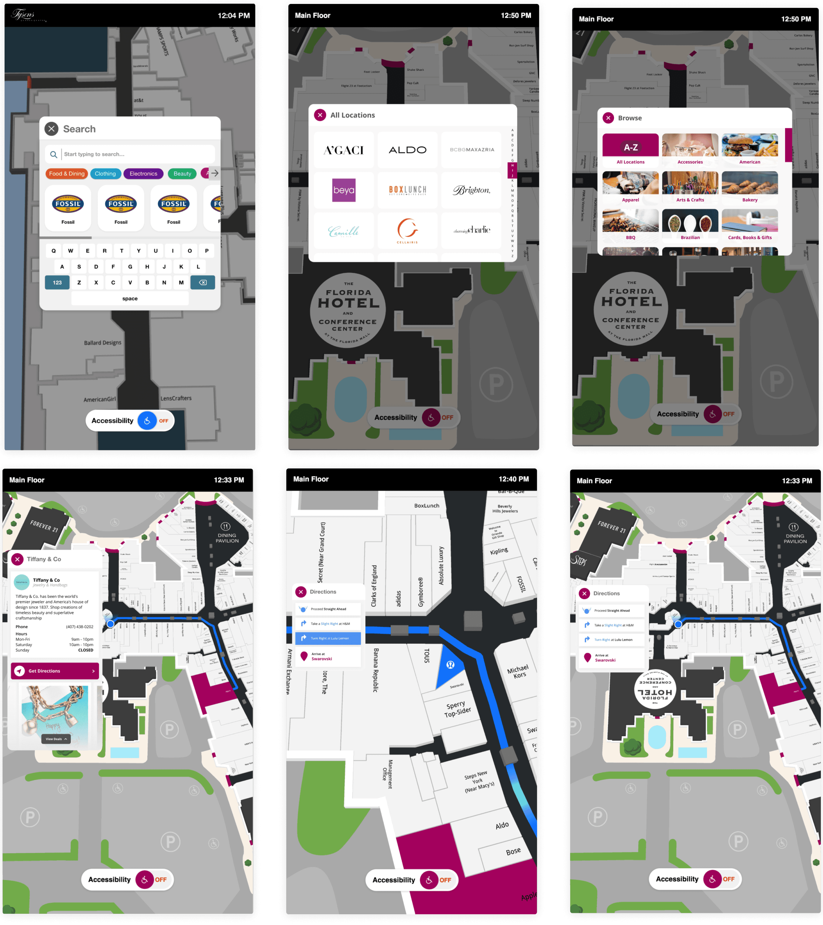
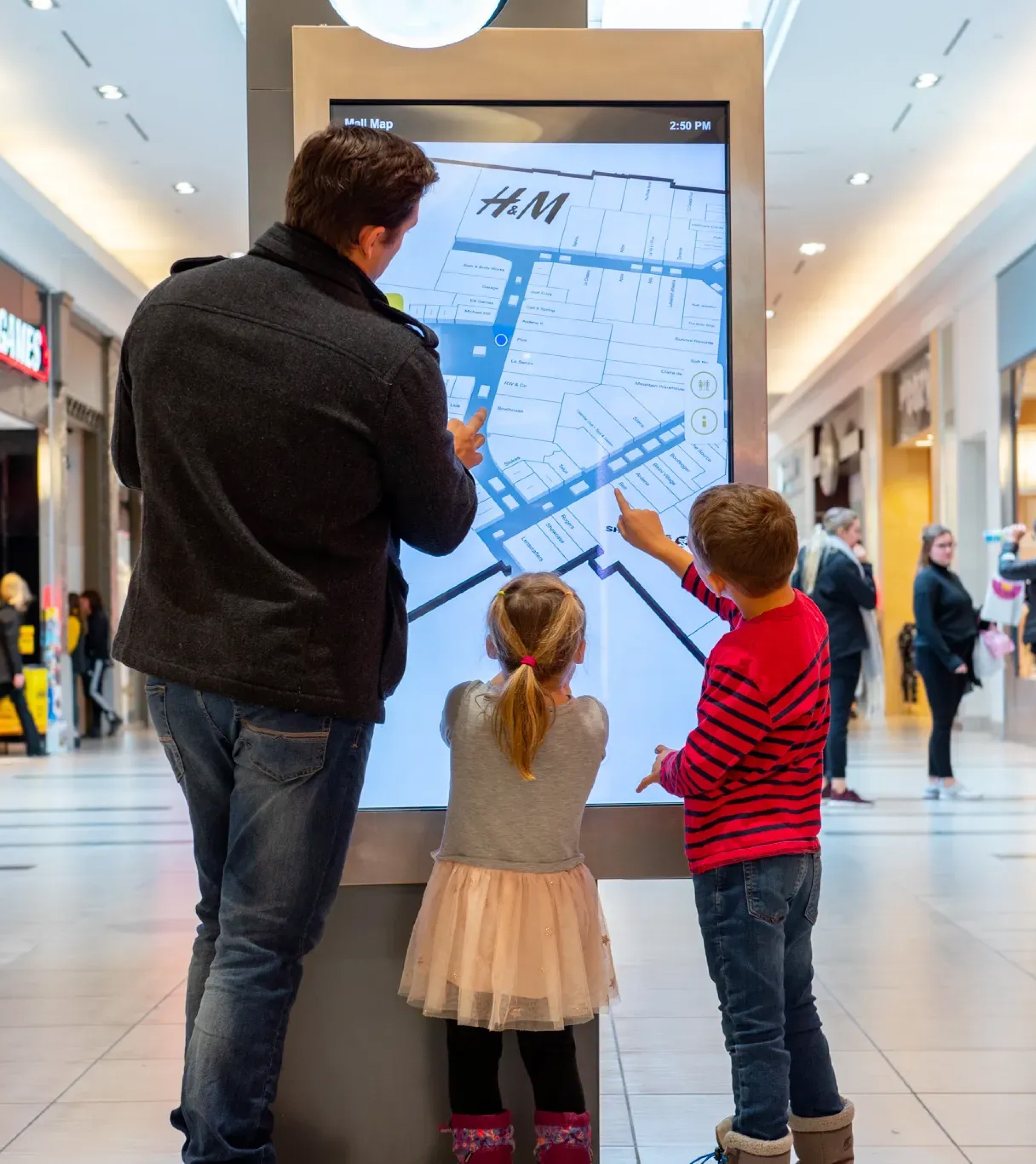
We made the map full-screen for directions, location selection, and venue exploration, while retaining focused screens for search, events, and category browsing. The map was always one tap away.
Design for reach and accessibility
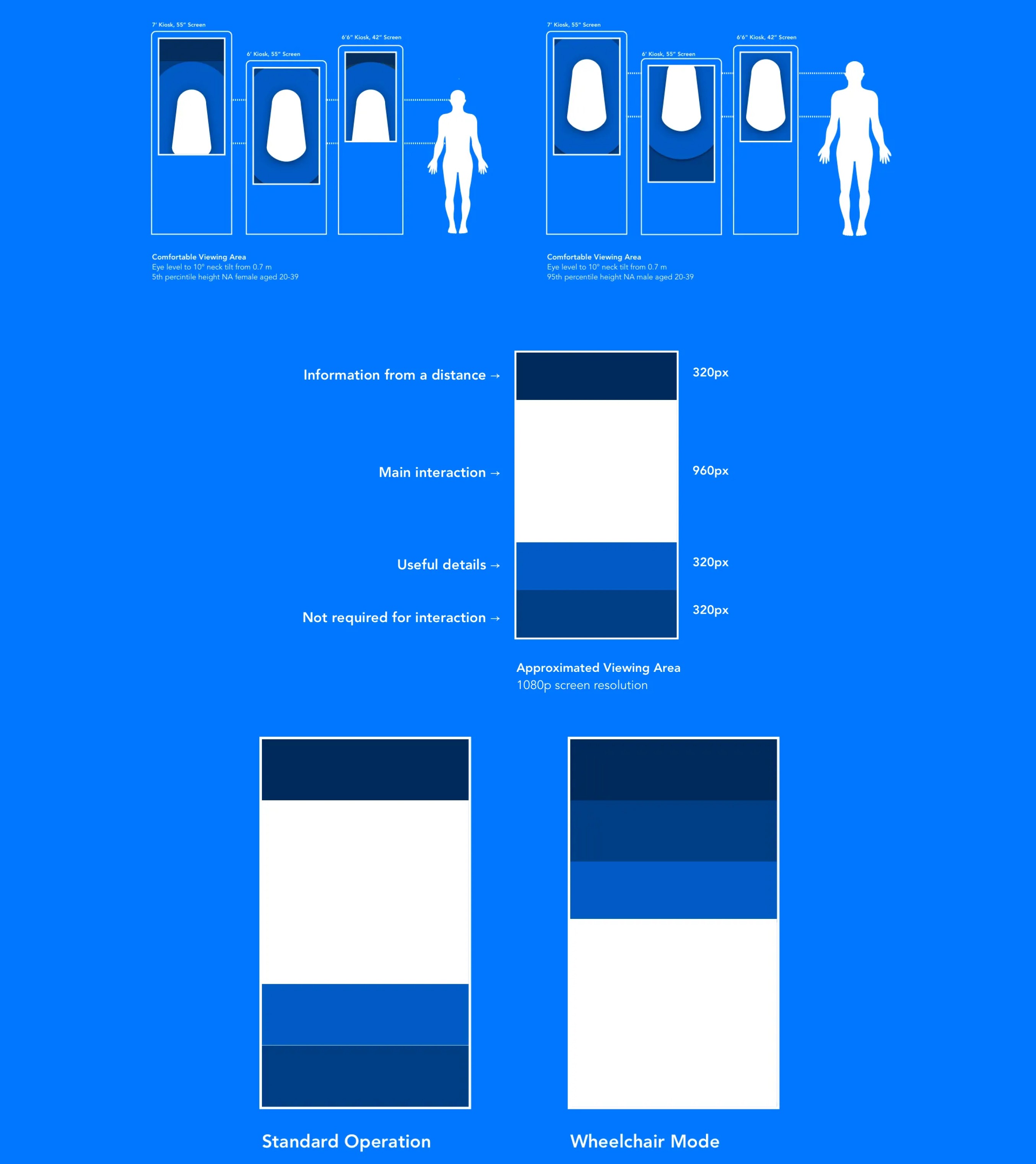
Research into user height and touch zones helped us design for visibility and reach. An accessibility control lowered the interface when needed, and route preferences could prioritize ramps or elevators.
Make infrequent use feel familiar
We used recognizable interaction patterns, then repeatedly tested type size, touch targets, state transitions, and information density on the actual displays.
Balance utility and venue value
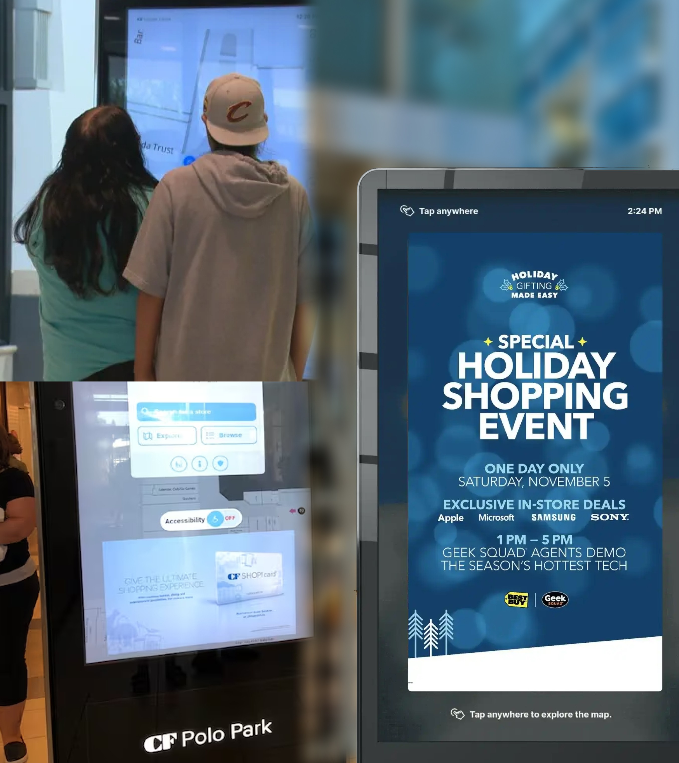
Advertising space followed digital-out-of-home patterns already familiar to operators without taking over the core task. A dedicated Events area gave venues another useful way to reach visitors.
Simplify multi-floor directions
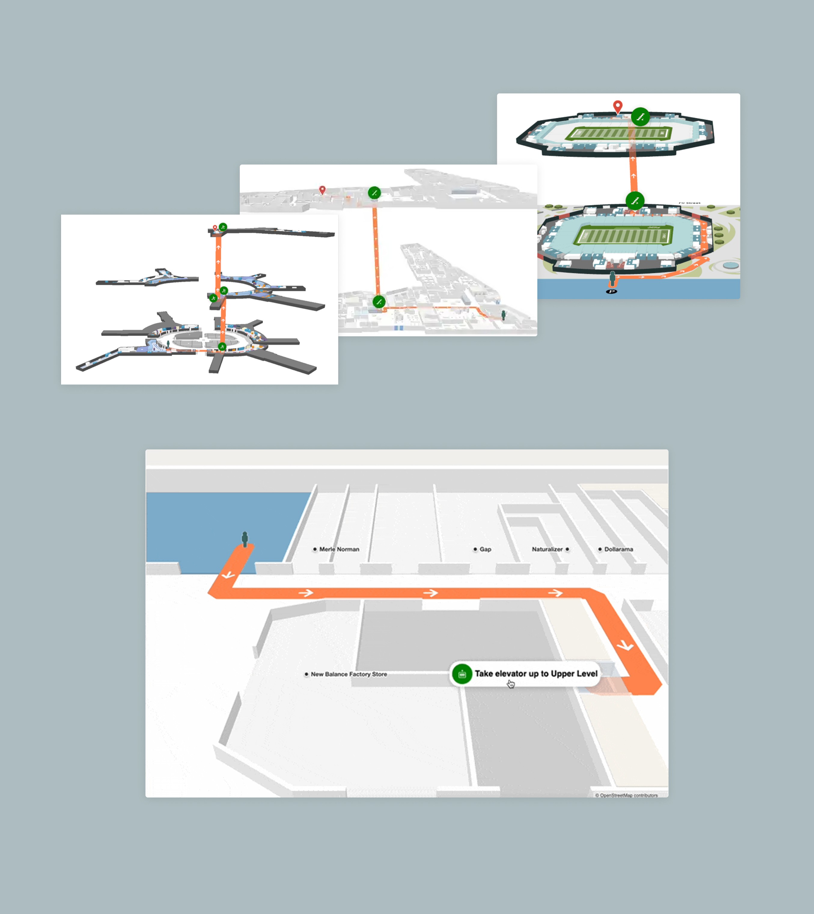
We added stacked-map support to the SDK so an entire multi-floor journey could be understood at once. In a single-floor view, the map automatically selected the correct floor, zoom, position, and direction of travel.
Final notes
Large-format touchscreens introduced unusual constraints around discoverability, accessibility, reach, and spatial awareness. The directory also had to balance end-user needs with venue business goals such as ad revenue. The redesigned product was ultimately deployed to thousands of venues.
After moving into a Product Management role, I worked with a new product designer on a UI refresh and helped launch voice control, Broadsign ad integration, and machine-learning-powered smart search.